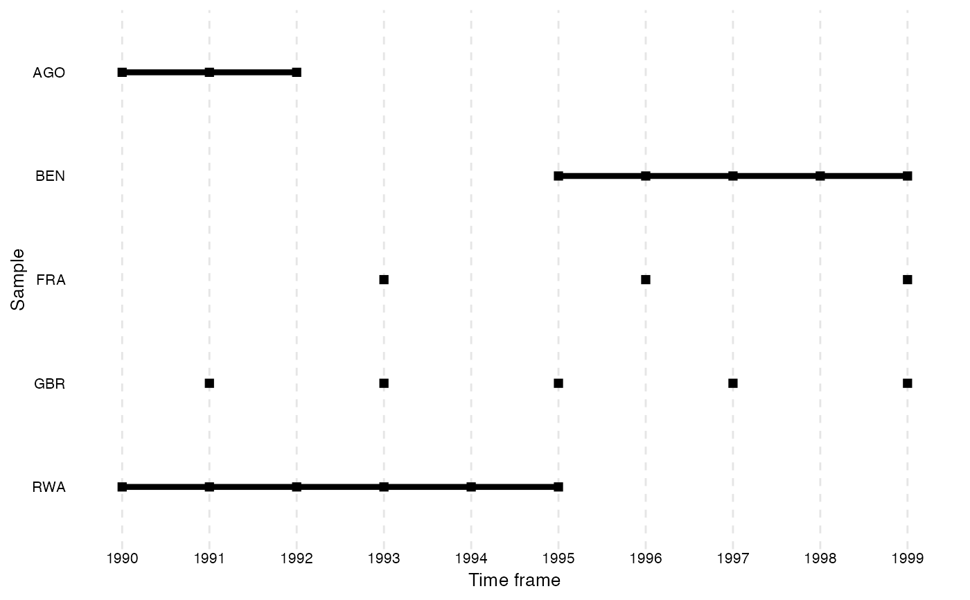
This function plots a ggplot to visualize the distribution of scope objects across the time frame.
Usage
overview_plot(
  dat,
  id,
  time,
  xaxis = "Time frame",
  yaxis = "Sample",
  asc = TRUE,
  color,
  dot_size = 2
)
Arguments
- dat
Your data set
- id
Your scope (e.g., country codes or individual IDs). If the id variable contains NAs, they will not be included in the plot.
- time
Your time (e.g., time periods given by years, months, ...)
- xaxis
Label of the x axis ("Time frame" is default)
- yaxis
Label of the y axis ("Sample" is default)
- asc
Sorting the y axis in ascending order ("TRUE" is default)
- color
Optional argument. Either a column variable (for conditional coloring) or a color string (e.g.,
"steelblue") to paint all lines/points a fixed color. Whencoloris a column variable the returned ggplot object can be extended with+ ggplot2::scale_color_manual()or+ ggplot2::scale_color_brewer()to apply custom palettes.- dot_size
Option argument that defines the dot size (default is 2)
Examples
data(toydata)
overview_plot(dat = toydata, id = ccode, time = year)
#> Warning: Using `size` aesthetic for lines was deprecated in ggplot2 3.4.0.
#> ℹ Please use `linewidth` instead.
#> ℹ The deprecated feature was likely used in the overviewR package.
#>   Please report the issue at <https://github.com/cosimameyer/overviewR/issues>.