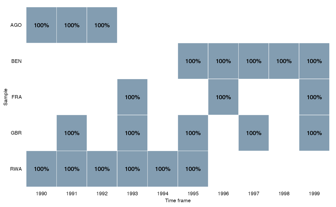
This function plots a heat map to visualize the coverage of the time-scope-units of the data. Options include total number of cases per time-scope-unit or relative number in percentage.
Usage
overview_heat(
  dat,
  id,
  time,
  perc = FALSE,
  exp_total = NULL,
  xaxis = "Time frame",
  yaxis = "Sample",
  col_low = "#dceaf2",
  col_high = "#2A5773",
  label = TRUE
)
Arguments
- dat
The data set
- id
The scope (e.g., country codes or individual IDs). The axis is ordered in ascending order by default.
- time
The time (e.g., time periods given by years, months, ...)
- perc
If FALSE (default) plot returns the total number of observations per time-scope-unit. If TRUE, it returns the number of observations per time-scope-unit in percentage
- exp_total
Expected total number of observations (i.e. maximum) for time unit.
- xaxis
Label of your x axis ("Time frame" is default)
- yaxis
Label of your y axis ("Sample" is default)
- col_low
Hex color code for the lowest value (default is "#dceaf2")
- col_high
Hex color code for the lowest value (default is "#2A5773")
- label
If TRUE (default), the total number of observations/percentages of observations are displayed. If FALSE, it returns no labels.
Examples
data(toydata)
overview_heat(toydata, ccode, year, perc = TRUE, exp_total = 12)